The new look of Pringles: redefining its identity
In an era where brand identity and environmental sustainability are increasingly pivotal to consumer loyalty and market differentiation, the story of Pringles’ rebranding journey emerges as a beacon of innovation and adaptability.
In an era where brand identity and environmental sustainability are increasingly pivotal to consumer loyalty and market differentiation, the story of Pringles’ rebranding journey emerges as a beacon of innovation and adaptability. As we delve into the intricacies of how this iconic brand navigated the challenges of modernizing its identity while committing to environmental responsibility, we uncover lessons and strategies that can enlighten and inspire businesses across the spectrum.
The Story of an Unmistakable Logo
Since its introduction to the market in 1967, Pringles has stood out not only for its innovative tube-shaped packaging but also for its visual identity centered around the charismatic Mr. Pringles. Over the years, the brand has undergone a series of transformations, always maintaining a fresh and contemporary image that resonated with its audience.
In 2020, Pringles decided to give its iconic mascot, Julius Pringle (better known as Mr. P), a significant visual update, the first in more than two decades. For years, Mr. P maintained his iconic appearance, with no major changes reflecting design trends. However, recognizing the importance of adapting to contemporary visual preferences, which lean towards flatter and more simplified styles, Pringles embarked Mr. P on a renovation journey. This transformation was no easy task and took approximately two years to complete the transition to a more “flat” look.
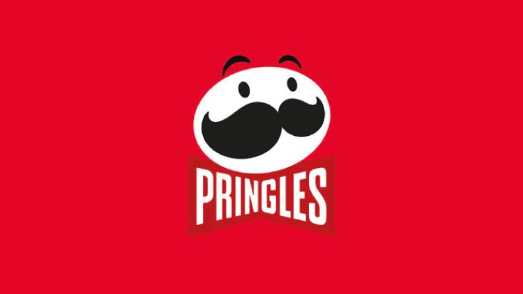
In this process, Mr. P underwent a radical change: he lost all his hair, now presenting himself completely bald. Despite this bold change, the reception has been positive, with many commenting that the new style suits him well. With his updated face, it is now possible to appreciate more clearly his bright eyes, expressive eyebrows, stylish mustache, and his iconic bow tie with his name engraved on it.
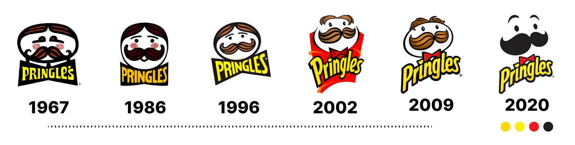
This redesign represents more than a simple aesthetic change; it marks Pringles’ commitment to evolution and modernization. The decision to adopt a simpler and flatter design reflects not only current trends in graphic design but also the brand’s desire to remain relevant and appealing to today’s audiences. Mr. P’s new image is a testament to the balance between preserving the heritage of an iconic brand and embracing change to connect with new generations.
Mr. Pringles’ Redesign: A Step Towards Modernity
The most recent redesign of the Pringles logo introduced a notable simplification of its mascot, Mr. Pringles. Previously characterized by more realistic details like expressive eyes, eyebrows, and a detailed mustache, the new design adopts a minimalist approach. This renovation not only seeks a more modern and stylized look but also aligns with current design trends, where simplicity and visual clarity gain ground. This change is a testament to Pringles’ desire to remain relevant and attractive to current and future generations, demonstrating that even the most traditional brands can be renewed without losing their essence.
Packaging: Beyond the Logo
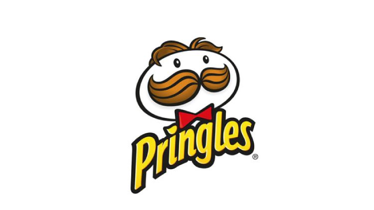
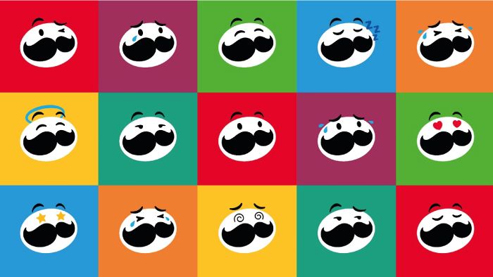
The refresh of the Pringles logo ushers in an era where the packaging isn’t just a container but a canvas for expressive branding. Featuring prominently on this canvas is the revamped Mr. P, adorned with an expressive pair of eyebrows and an oversized red bow tie, bringing an animated charisma to the product. To further accentuate the can’s revamped aesthetic, Pringles refined its mustachioed mascot, enhancing his features to better highlight the variety of flavors each can holds. The sleeker Mr. P, with his dynamic mustache, sharper bow tie, and sparkling eyes, embodies a range of emotions that reflect the irresistible taste of Pringles crisps.
Della Lawrence, JKR’s creative director, emphasizes the central role of Mr. P in the brand’s new identity, aiming to invigorate him with a lively presence both on the shelf and in digital realms. Through this strategic redesign, Pringles not only revitalizes its mascot but also cements its position as a brand that infuses fun and personality into every product, ensuring that Mr. P continues to be synonymous with the unique Pringles experience.
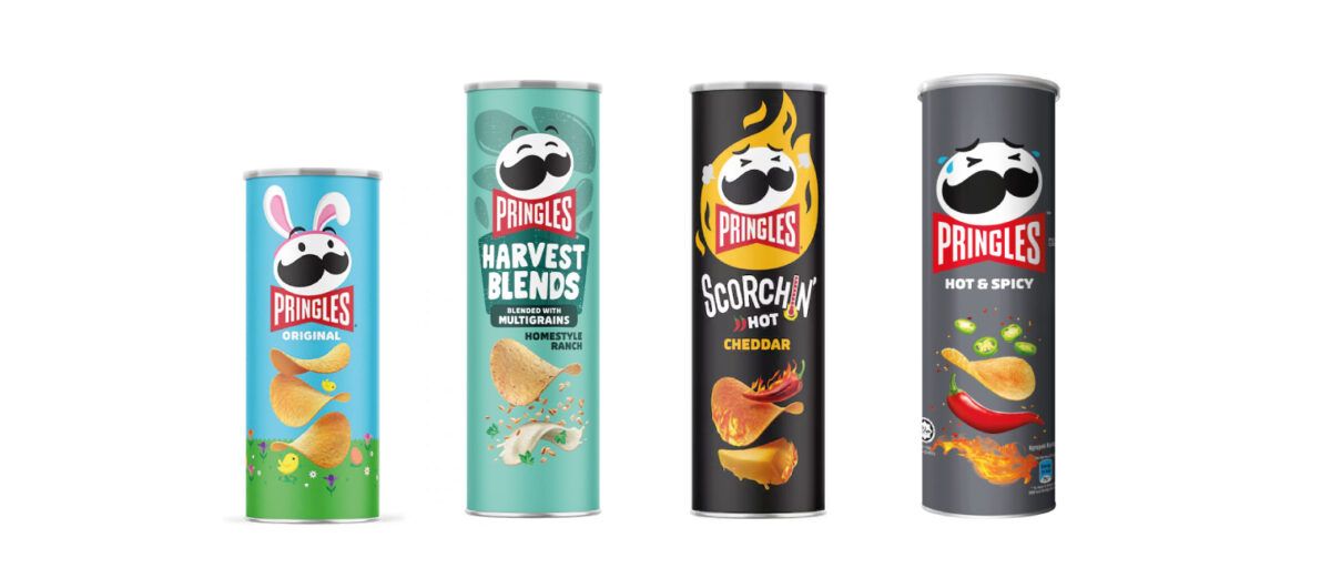
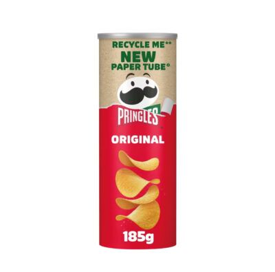
Pringles has innovatively updated its iconic cans to embrace sustainability, replacing the non-recyclable steel base with recycled paper and a recyclable lid, initially available exclusively at Tesco. This change, rigorously tested to ensure 15 months of freshness, marks a major step in eco-friendly packaging, demonstrating the brand’s commitment to responsible manufacturing and adaptability.
The Unforgettable Super Bowl Spot for Pringles
In their latest commercial for the Super Bowl, Pringles took a creative leap by featuring Chris Pratt in an amusing and memorable narrative. As Pratt purchases a can of the beloved chips, the cashier remarks on his uncanny resemblance to Mr. P, the iconic, mustachioed brand mascot. Initially, Pratt brushes off the comparison, but soon, both he and those around him are swept up in the realization—they simply can’t ignore the similarity. The ad cleverly plays on this moment of recognition, using humor and the universally recognized figure of Pratt to refresh its brand identity. This approach not only entertains but firmly implants Pringles in the minds of viewers, making it a standout piece in the advertising blitz of the Super Bowl.
What can we learn from the Pringles rebrand?
The evolution of the Pringles logo isn’t just a design story — it’s a masterclass in brand strategy, emotional connection, and adaptability. Here are key lessons marketers, designers, and brand leaders can take from this iconic transformation:
Create with a story in mind
The origin of the Pringles logo — inspired by a tennis ball can lid — and the creation of Mr. Pringles as a cheerful baker give the brand visual narrative depth. A logo with a backstory is far more memorable and shareable.
💡 Lesson: Give your visual identity a story. A strong origin builds brand equity and emotional connection.
Evolve without losing recognition
Over the years, Pringles has simplified and modernized its logo while keeping essential elements: the mustache, bow tie, and circular frame. This approach feels current without losing the familiarity that consumers love.
💡 Lesson: A rebrand doesn’t mean starting from scratch. Keep your “visual anchors” and adapt them to new contexts.
Adapt to the digital and regulatory environment
Flat design isn’t just a trend — it serves functional and legal needs. Logos must work at small sizes (favicons, app icons) and comply with advertising laws (especially for high-sugar, salt, and fat products). Pringles’ bow tie with embedded text was a smart, strategic move.
💡 Lesson: Design for context. Your logo needs to be versatile, clear, and regulation-friendly.
Lead with emotional branding
Mr. Pringles has always embodied fun, warmth, and approachability. Even the simplified versions maintain this emotional tone, turning the logo into more than just a graphic — it becomes a feeling.
💡 Lesson: Inject emotion into your brand. Emotional connection builds loyalty and brand stickiness.
Know when to let go
In the 2020 redesign, iconic elements like the hair and yellow text were removed in favor of simplicity and clarity. These decisions, while nostalgic to some, served a bigger strategic purpose.
💡 Lesson: Good design often requires sacrifice. Prioritize clarity and alignment over sentimentality.
Expect resistance — and communicate
Some consumers push back against change. Without explanation, people may criticize the brand. The key? Communicate the “why” behind your redesign, especially to loyal fans.
💡 Lesson: Rebrands without storytelling miss an opportunity. Clear communication builds trust and drives adoption.
Frequently Asked Questions
- What does the new Pringles logo design represent?
The new design aims to convey modernity and align with today’s visual style, while still preserving the brand’s playful and recognizable essence. - How did the public react to the new Pringles logo?
The response has been mixed: while some celebrate the minimalist approach, others feel nostalgic about the previous version. However, most agree that the brand successfully retained its core identity. - Who designed the new Pringles logo?
The redesign was carried out by the agency Jones Knowles Ritchie (JKR), known for working with global brands on visual identity projects. - Did this change only affect the logo, or the product as well?
The change was primarily visual but is part of a broader strategy that includes sustainable packaging and fresh advertising campaigns. - What other brands have undergone similar rebrandings?
Other brands that have adopted flatter and more modern designs include Burger King, Pepsi, and Warner Bros., all aiming to stay relevant to newer generations.
Conclusion
Pringles’ transformative journey in redefining its visual identity and embracing sustainability illustrates a pivotal moment in the brand’s history. This evolution underscores the brand’s enduring relevance and foresight in steering towards a more eco-conscious future. Through innovative solutions to modern challenges, Pringles exemplifies how legacy brands can stay ahead, resonating with new audiences while preserving their quintessential character. This strategic rebranding commitment to continual adaptation, innovation, and leadership in environmental stewardship showcases a harmonious blend of traditional values with modern practices.
Inspired by Pringles’ successful evolution, BlueTide invites you to embark on your own journey of brand transformation. We’re here to guide you through every step of embracing change without losing the essence of what makes your brand unique. Let’s work together to craft a brand identity that stands the test of time, resonating with current trends and future aspirations.