BlueTide’s Rebranding: Unveiling a new era
The story of BlueTide begins with a vision cast in 2013 by four friends in Panama. Motivated by a shared ambition to enhance the web presence of businesses in the ever-expanding digital ocean, BlueTide was born. This venture adopted a philosophy centered around maximizing a company’s online visibility and engagement, an ethos that has guided us through our journey in the digital landscape.
Introduction
Innovation is the spark of evolution. At BlueTide, we embody this ethos. Our recent rebranding isn't just a facelift; it's a reinvention of our identity, mirroring the dynamic nature of the digital landscape. This transformation marks a significant milestone in our journey, symbolizing growth, adaptability, and our relentless pursuit of excellence.
Reflecting on our origins
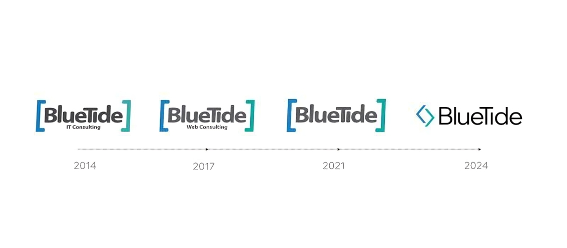
Our initial branding served as a robust foundation, reflecting our core expertise in web development and digital marketing. It resonated with our clients and positioned us as a trusted partner in the digital world. However, in an industry driven by perpetual change, we realized the need to evolve.
Embracing change
The decision to rebrand stemmed from a deep understanding of market trends and our commitment to staying at the forefront of innovation. As our services expanded and technology advanced, we recognized the need for a brand that would accurately represent our growing capabilities and vision.
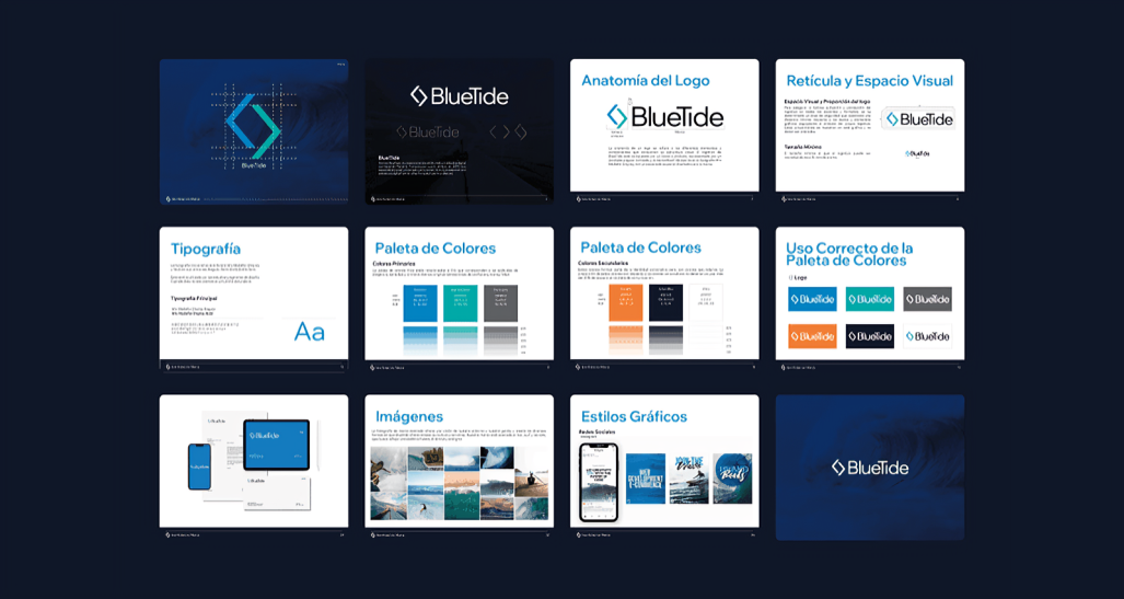
Detailed rebranding elements
Logo: A symbol of evolution
The transition from brackets to angular brackets in our logo is a powerful symbol. It reflects our journey from traditional web development to pioneering new frontiers in the digital space. This subtle yet profound change signifies our role as architects of the digital world, crafting solutions that are not just functional but visionary.
Typography: The voice of our brand
The introduction of Wix Madefor Display, coupled with Lato, represents a harmonious blend of modernity and reliability. This typographic update is more than aesthetic; it’s a reflection of our dynamic approach to communication – bold, clear, and forward-thinking.
Color Palette: A visual story
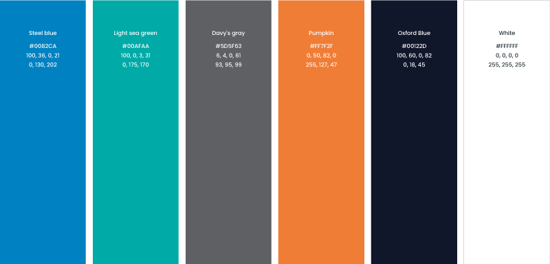
Our new color scheme, with Steel blue and Light sea green, tells a story of strength, reliability, innovation, and calmness. These colors were chosen to evoke a sense of trust and tranquility, mirroring our approach to tackling digital challenges with poise and confidence.
Photographic style: Capturing our essence
The revised photographic guidelines focus on blending natural elements with digital innovation. This style aims to showcase our commitment to creating solutions that are not only technologically advanced but also sustainable and mindful of the human experience.
Core values and goals
Our rebranding is anchored in our core values – honesty, teamwork, excellence, and commitment. These values are the bedrock of our operations and our guiding principles as we move forward. Our goal is to redefine the standards of digital solutions, constantly pushing the boundaries of what's possible.
Unique selling points
BlueTide's unique position stems from its deep roots in Panama, combined with a global perspective. This rebranding fortifies our commitment to being at the cutting edge of coding and web design, reinforcing our status as a trailblazer in the digital world.
Tone and Message
Our narrative is one of introspection and enthusiasm. We’re not just evolving in appearance; we’re undergoing a metamorphosis in our approach and philosophy. BlueTide is set to lead, innovate, and inspire in the digital era.
Be part of our transformative journey. Sign up for our newsletter to get insights into our innovative projects and developments.
Frequently Asked Questions
- What is corporate rebranding?
Rebranding is a strategic process in which a company updates its visual identity, messaging, and sometimes even its philosophy to better reflect its values and adapt to new market trends. - Why did BlueTide decide to rebrand?
Because the digital industry is constantly evolving. To remain leaders, we need our brand to communicate innovation, trust, and a global vision. The rebrand reflects our transformation as a company and the expansion of our services. - What elements changed in BlueTide’s new identity?
The logo was redesigned, the typography updated, a new color palette was defined, and the photographic style was refreshed—all focused on conveying modernity, reliability, and innovation. - How does this change impact clients?
BlueTide’s clients benefit from a clearer, more modern brand that is aligned with its value promise. The rebrand reinforces our commitment to excellence, transparency, and the development of innovative digital solutions. - Is this just a visual change?
No. BlueTide’s rebrand is a comprehensive transformation that includes organizational culture, value proposition, and future vision. It’s not just aesthetics—it’s a strategy to continue leading the digital world.
Conclusion
BlueTide's rebranding is more than just a change of logo, color palette, or typography. It is a comprehensive transformation that touches every aspect of our business – from our core values and vision to our approach towards clients and projects. It's a bold step into the future, a future we are eager to explore and shape alongside our clients and partners. We invite you to join us on this exhilarating journey towards digital mastery, where every tide brings a new wave of opportunities and possibilities.
As we finalize this blog post, we do so with a sense of pride and anticipation. We are excited about the path ahead and look forward to sharing our journey with you. Join us as we sail into a future where innovation, excellence, and customer-centric solutions are not just goals but realities. Welcome to the new BlueTide – where every challenge is an opportunity, and every client's dream is a potential reality.