14 Keys to Designing Landing Pages That Truly Convert in 2025
Explore the 14 best landing page practices in 2025 to boost conversions. Learn how to optimize headlines, CTAs, forms, and build trust, with examples in WordPress, Shopify, WooCommerce, and AI-powered tools.
Introduction
In today’s digital world, where user attention lasts only a few seconds, having a well-designed landing page can be the difference between losing a visitor and gaining a customer. A landing page is built with a very specific purpose: to capture leads, sell a product, generate a subscription, or guide users toward a single action.
What makes a landing page unique compared to a traditional website is its focus on one clear objective. It’s not about presenting everything your business does, but about guiding your audience toward conversion with as little friction as possible.
By 2025, the rules have changed: Google now prioritizes user experience (Core Web Vitals, relevance, and speed), and the rise of generative AI has transformed how landing pages are designed and optimized. Today, AI-powered tools can create landing pages in minutes, but the true difference still lies in strategy, personalization, and alignment with business goals.
In this article, we’ll explore the 14 best practices for building effective landing pages, highlight concrete examples in WordPress, Shopify, WooCommerce, and AI page builders, and share our perspective at BlueTide, where we design and develop digital ecosystems that truly convert.
1. Create a clear header section
You have less than 10 seconds to capture attention. Your landing page headline must immediately answer three questions:
- What are you offering? Example: “Online invoicing software for small businesses.”
- Why should it matter to me? Example: “Save 10 hours of work every week.”
- What’s the next step? Example: “Start your free 14-day trial.”
For eCommerce, a strong headline might be: “Discover the 2025 sandal collection – Free shipping across Panama.”
2. Keep it simple
Less is more. A landing page should have a clean design, a clear hierarchy, and a single conversion path. Too many menus, images, or long blocks of text distract visitors and lower conversion rates.
Example: Instead of including a full navigation bar, add only a fixed CTA like “Buy Now” or “Request a Demo.”
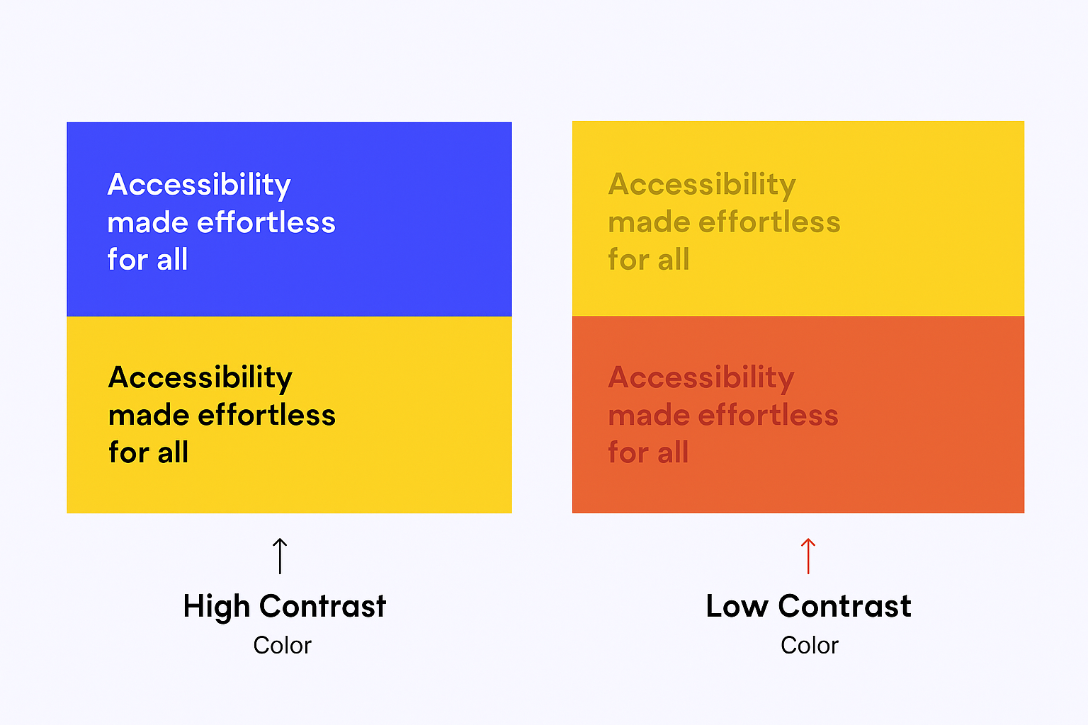
3. Use contrasting colors
Color is key to directing user attention. Your CTA button should stand out from the rest of the page. If your design is primarily white and blue, an orange or green button will grab more attention.
A HubSpot study found that changing a CTA button from red to green increased conversions by 21%.
4. Optimize for Mobile
Over 70% of web traffic now comes from smartphones. A slow or poorly adapted mobile landing page can cost you valuable leads.
Best practices:
- Mobile-first design.
- Large, thumb-friendly buttons.
- Load times under 2 seconds.
At BlueTide, we always test our landing pages across devices before launch.
5. Use High-Quality Images and Videos
Visual content builds trust and increases engagement. A real photo of a customer using your product is worth more than ten generic stock images.
A 60-second video can explain a complex service and increase purchase intent by up to 80%.
6. Include Social Proof
People trust people more than brands. Add reviews, ratings, and client testimonials.
Example:
“With BlueTide, we increased our online sales by 40% in just three months.” – eCommerce client in Panama.
7. Use a Clear, Compelling CTA
Your CTA should be visible, concise, and action-oriented. Instead of a generic “Submit,” use:
- “Download the Guide”
- “Book Your Consultation”
- “Get Started Today”
Place CTAs in multiple strategic points across the page, not only at the bottom.
8. Test and Improve
A landing page is never finished. The key is A/B testing: try variations in your headline, button color, or form length to see which version converts better.
At BlueTide, we use advanced analytics and heatmaps to understand how users interact with pages and refine them continuously.
9. Stay relevant
If a user clicks on a Google Ads campaign that says “Landing Page for eCommerce in Panama”, your page should display that exact message in the headline.
Consistency between ad and landing page increases trust and reduces bounce rate.
10. Reduce friction in forms
Long forms discourage conversions. Break information into multi-step forms:
Name and email.
Company information.
Additional details.
By reducing cognitive load, users move forward more easily.
11. Minimize manual Input
Make it simple with pre-filled fields, drop-down menus, or checkboxes. Instead of asking, “What’s your budget?”, provide predefined ranges.
This improves conversion rates and makes data analysis easier.
12. Build Trust Sections
Visitors need reassurance. Add:
- Trust badges (SSL, payment methods, certifications).
- Clear refund and privacy policies.
- Guarantees like “30-day money-back guarantee.”
13. Say “Thank You”
After a conversion, redirect users to a Thank You page. Use it to:
- Confirm their registration.
- Offer an additional resource.
- Invite them to follow you on social media.
A well-designed Thank You page is part of the sales funnel, not the end of it.
14. Use A/B Testing for Continuous Improvement
A landing page can always perform better. A/B testing means creating two variations of an element (headline, button, form, or image) and showing them to different user segments to see which performs best.
What to test:
- Headlines: benefit-driven vs. emotional.
- CTAs: “Request Demo” vs. “Get Started Today.”
- Button colors: blue vs. orange.
- Form length: 2 fields vs. 5 fields.
- Images: product vs. customer photo.
Benefits:
- Data-driven optimization.
- Continuous conversion improvement.
- Better user experience.
- Higher ROI long-term.
At BlueTide, we implement A/B testing with tools like VWO, Optimizely, or Unbounce, integrated with WordPress, Shopify, or WooCommerce, ensuring every landing page evolves and stays competitive.
Inspiring Landing Page Examples
Calm
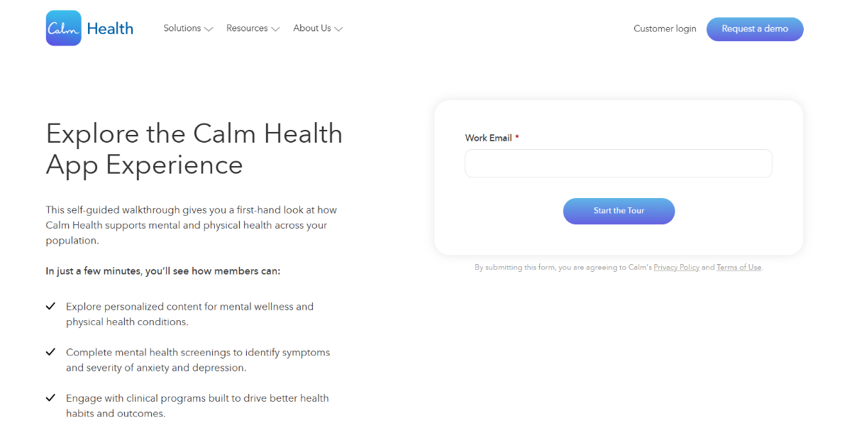
Purpose: Simplify onboarding for new users of Calm Health, the mental wellness app.
Standout features:
- Minimalist design: a simple signup form with bullet-point benefits.
- Aligned visual identity: white space and soft colors that reflect Calm’s brand.
- Simple form: requests only essential details to reduce friction.
- Scroll-free experience: everything is placed above the fold for faster conversions.
Result: A clean, focused page aligned with its goal of driving signups quickly.
Shopify
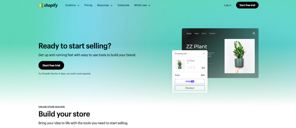
Purpose: Attract new users with a free trial of the Shopify eCommerce platform.
Standout features:
- Hero with input and CTA: “Start your free trial” front and center.
- Benefit-driven copy: highlights simplicity, security, and flexibility.
- Collapsible FAQ: answers questions without cluttering the design.
- Linear flow: guides users from benefits straight to the CTA.
- Persistent CTA: repeated across scroll points to reinforce the action.
Result: A clear example of how a landing page can balance trust, simplicity, and urgency.
FAQ on Landing Pages
What is a landing page in digital marketing? A page designed with a single goal: converting visitors into leads or customers, cutting distractions, and guiding them toward action.
When should you use a landing page? When running a specific marketing campaign (Google Ads, Meta Ads, email), launching a product, or capturing registrations for an event. A landing page focuses traffic and drives higher conversions than sending users to your homepage.
How do you optimize a landing page for better conversions? Through A/B testing, clear CTAs, simple forms, responsive design, and social proof. The aim is to minimize friction and streamline user action.
Why is a landing page more effective than sending users to the homepage? Because it avoids distractions. A homepage has multiple links and menus, while a landing page focuses on a single message and goal—leading to higher conversion rates.
What role does AI play in landing pages in 2025? AI helps generate design variations, test messaging faster, and personalize content based on user behavior—improving performance without heavy manual work.
Conclusion
Landing pages are the foundation of any lead generation or online sales strategy. An effective landing page combines clean design, social proof, strong CTAs, and ongoing optimization.
At BlueTide, as specialists in web development and eCommerce, we help businesses transform these best practices into measurable results. We work with WordPress, Shopify, WooCommerce, and AI tools to build landing pages that not only look great but also convert and drive real business value.
Ready to take your strategy to the next level? Let’s talk about your next landing page and create something amazing together.